
Your customers are searching for your products and services from their smartphones and tablets. A responsive website can make all the difference!
In 2014, mobile search volumes surpassed desktop search—meaning more people search for your products or services from a smartphone than a tablet, laptop, or desktop computer.
In April 2015, Google officially made mobile-friendliness a ranking factor—meaning if your website isn’t mobile-friendly, it will rank lower than websites that are when customers search on a mobile device.
Today, Google is working on building a mobile-only index, meaning if your business’s website is not mobile-friendly you may not appear in mobile search results at all. Once released, Google’s mobile index will be the primary search index the search engine uses to respond to queries.
Not sure if your website is mobile-friendly? Send us a message and we’ll investigate for you, or call US at (516) 500-7130 to learn more about our custom responsive website design services.
What is Responsive Web Design?
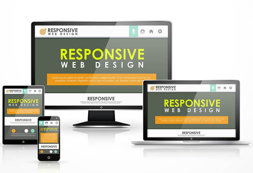
The purpose of responsive design is to have one site, but with different elements that respond differently when viewed on devices of different sizes.

Let’s Talk
Your Next Website
We ready to create a beautiful, lead-focused, responsive website for your company. We’ve worked with businesses of all sizes throughout their website design projects, from small local contractors and landscapers to enterprise organizations. BigTiny Designs is ready to take on your next project.

Let’s Talk
Mobile-Ready Responsive Websites
While there are many benefits to responsive websites, you can’t just throw your website in a responsive-friendly framework. We specialize in designing responsive websites and landing pages that are not only beautiful, but also rank well in search results and help achieve your business goals: increased traffic, leads, and sales.

Let’s Talk
Benefits of Responsive Website Design
Google has officially stated that they prefer responsive websites.
You only have to manage one website when it’s responsive, as opposed to having to manage both a desktop version and a mobile version.
You won’t have to worry about duplicate content, faulty redirects, or other common usability errors that separate mobile websites create.
Responsive websites offer the best usability for your visitors, as they’re compatible to all users on all devices.

Let’s Talk
“What Mobile-Friendly” Mean?
“Mobile-friendly” simply means that your website’s content and assets are accessible, legible, and usable to visitors on a smartphone.
Have you ever found yourself on a website that doesn’t display well on your tiny phone screen? A website where you have to zoom and pinch to read small text and clumsily click tiny buttons with what feel like giant sausage-like fingers?
In the past, most companies elected to build a custom mobile website. However, building a custom responsive website is now industry standard.
Let’s Talk About Your Next Website
If your website is not mobile-friendly, contact BigTiny Desifn. We are ready to create a beautiful, lead-focused, responsive website for your company. We’ve worked with businesses of all sizes throughout their website design projects, from small local contractors to enterprise organizations and we are ready to take on your next project.
Contact us online or call (516) 500-7130 to learn more about how your business can benefit from our custom responsive website design services.
